Color blindness doesn’t mean you can’t see the color. It just means that there are some pairs
of colors
that you have trouble distinguishing. So don’t rely on color alone. Let’s have a look
on the different
color blindness.
more about the different color vision disabilities, how to make sure your designs
are accessible, and how to create a dark mode.

Make sure that there is sufficient contrast between the elements in the foreground and background. You can always check this with an online contrast checker.
The Dark mode is one of the most requested features over the past few years. Both Apple and
Google made
a dark theme an essential part of UI. Dark theme reduces luminance and provide
safety in dark
environment and also reduces the eye strain.
Use online contrast checkers to ensure that there is proper
contrast in your designs to guarantee
accessibility.
Make sure your design are accessible. Ensure that any user with any visual impairment can use and consume your digital apps and websites. Get to know some important rules to make sure your designs are accessible.
Don’t just use color to convey information. If we only use color to make it clear where the user is, this will be difficult for a user with color vision impairment. Use additional elements to make it clear where you are.
Use headings and spacing to group related content and create some hierarchy in your designs. Find some examples here.
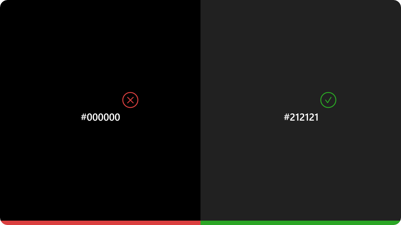
Pure black may increase the eye strain for the user. Dark grey on the other end is easier on eyes and
surfaces can express a wider range of color,
elevation and depth.
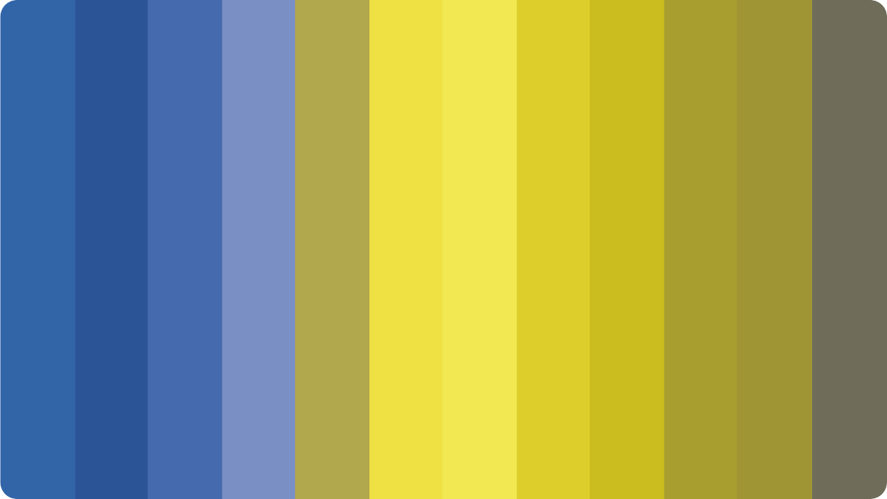
Saturated colors can look good on light surfaces. However, they can visually vibrate on dark surfaces, making reading much more difficult. It is better not to use so strongly saturated tones, as they are more legible on dark surfaces.
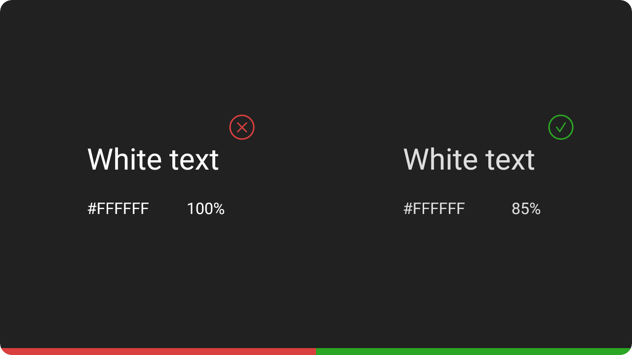
Don’t use pure white in dark theme, in case if
we would use pure white color it would visually
vibrate against dark backgrounds.
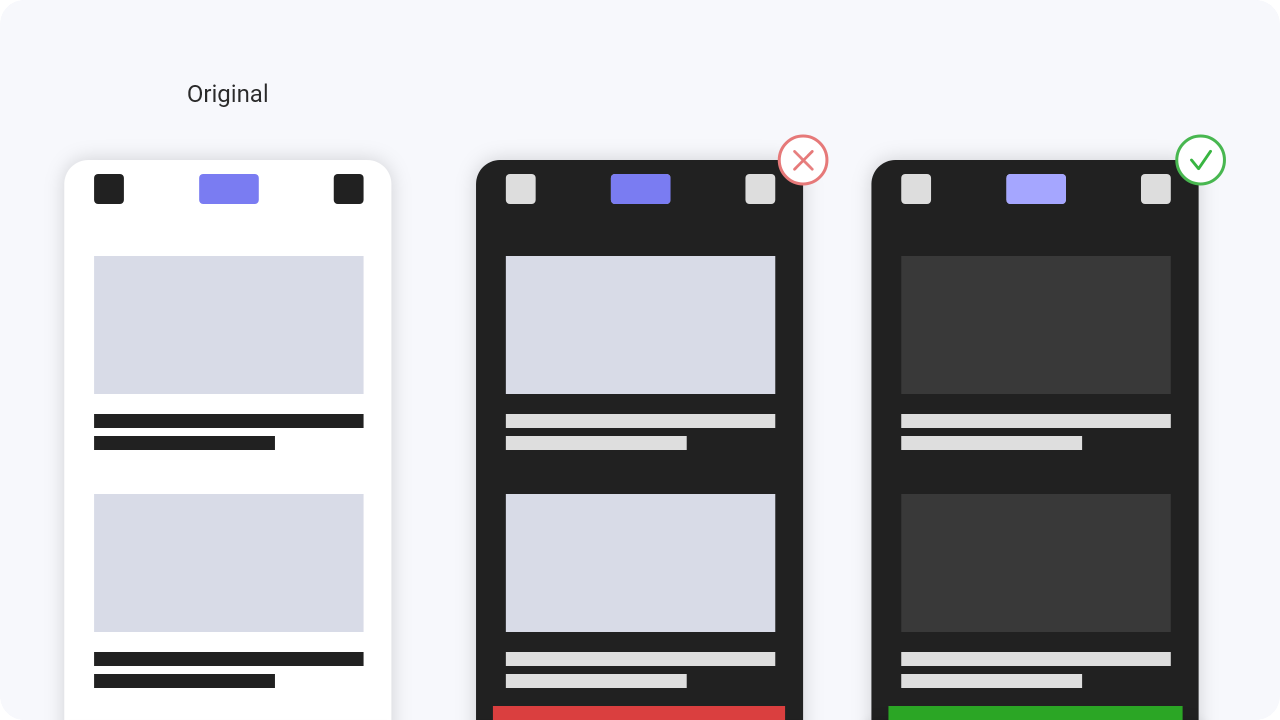
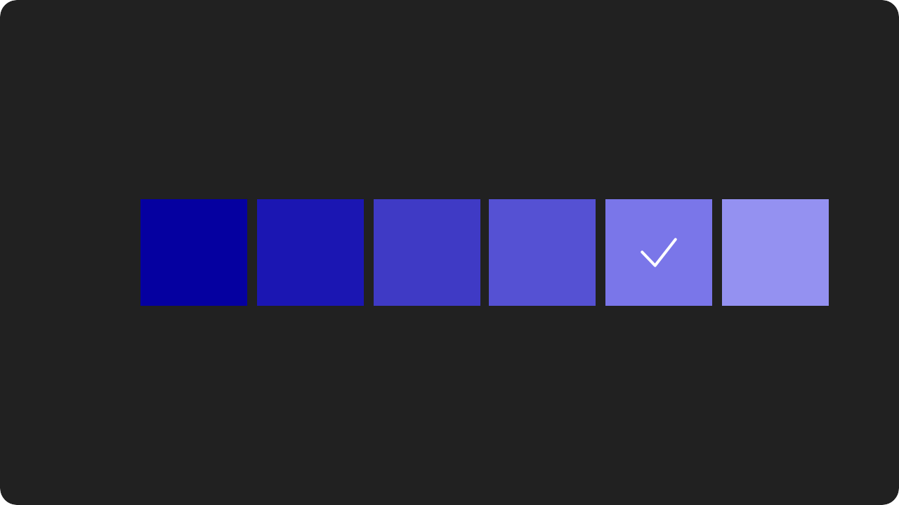
Don’t use large blocks of bright color in dark themes. The large blocks of color pulls focus from our most important elements.

When converting from an existing light theme to a dark theme one has to keep in mind the visual emotion that
is evoked by adjusting
the color contrast etc. A dark mode does not always have to be derived from the
existing light theme.