
Here you can find some navigation elements that are often used for desktops.
Be it to navigate the user
from one page to another or to navigate within a page
through the content.
Here are a few navigation elements that are commonly used and best suited for mobile devices.
Whether
it’s to navigate the user from one page to another or within a page through the content.
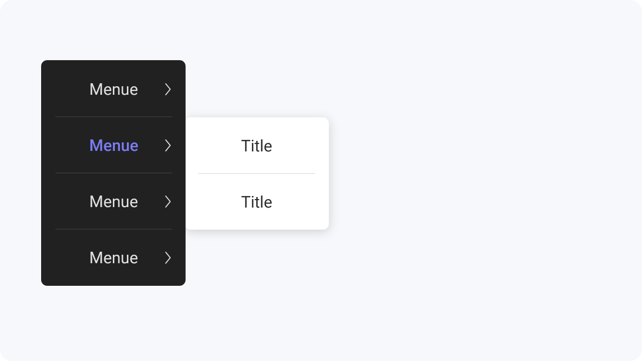
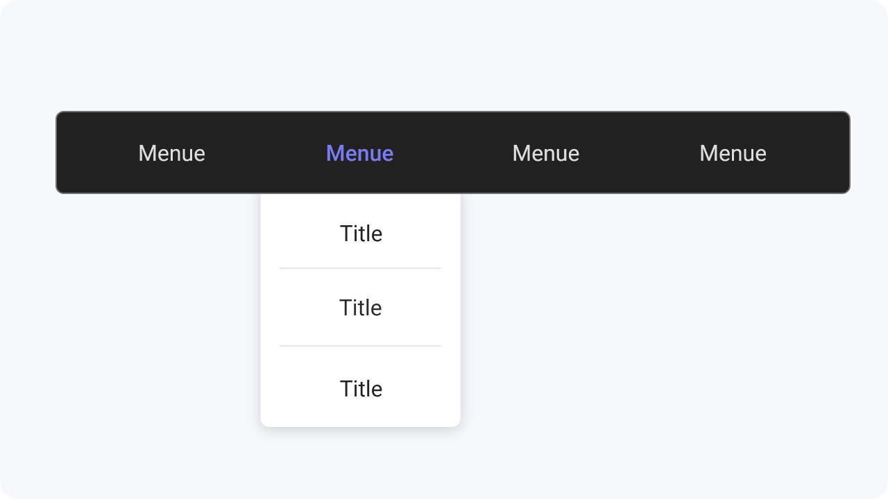
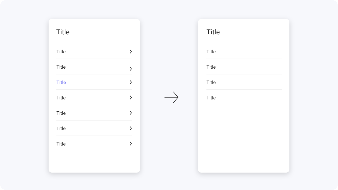
With fly out navigation, a category is clicked
from a main menu and a list of subcategories
opens. This navigation element is also very
clear and space saving.
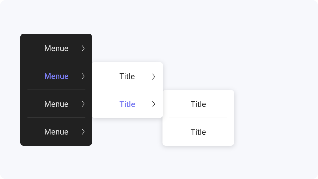
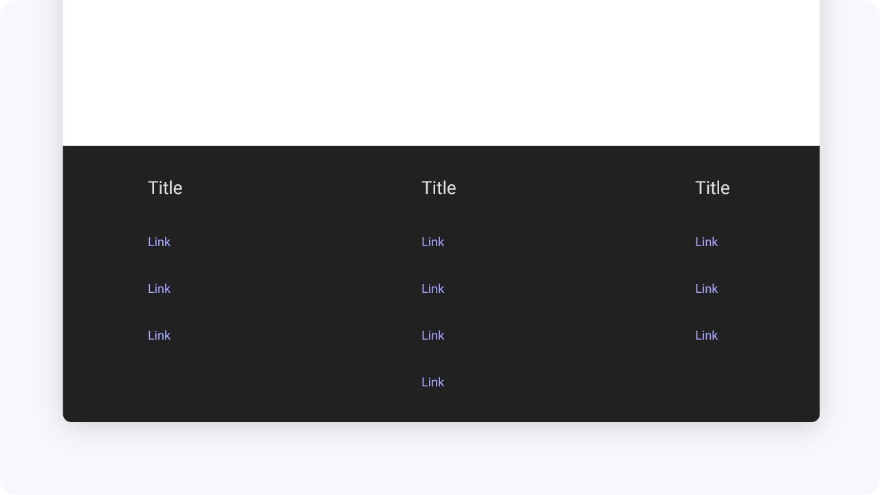
Cascading navigation is an additional navigation option to fly out navigation. It can also be applied to the
drop down navigation.
Here it is the case that when a category is clicked, another column with
subcategories opens, which in turn contains clickable subcategories. Here it
is important not to nest
the content too much and not to list too many navigation points.
A good number would be up to a max of
6 points.

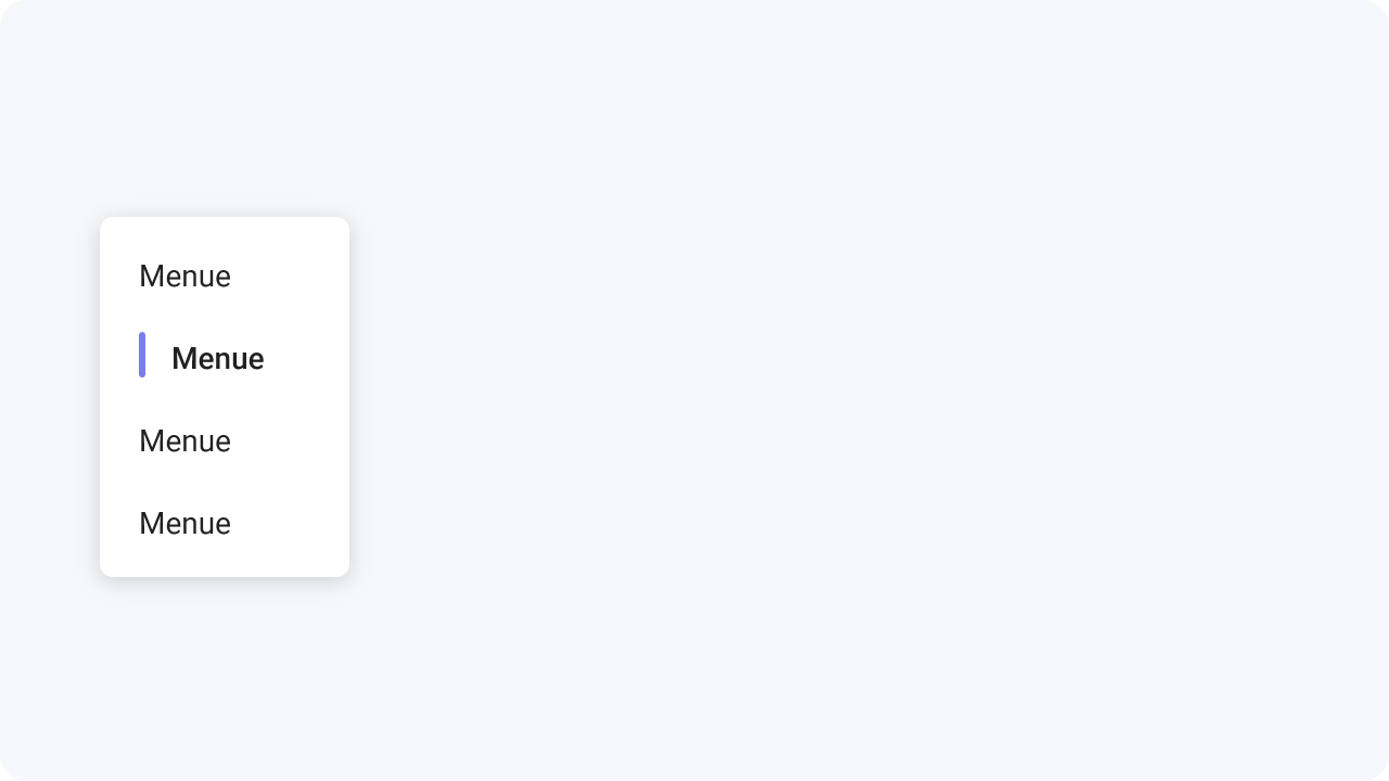
The drop down navigation unfolds by click or
hover over list of subcategories, which are mostly
arranged vertically. This navigation is very space saving and shows the content only after the user
activates it.
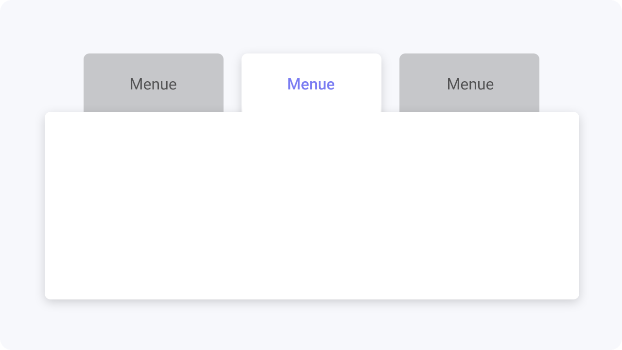
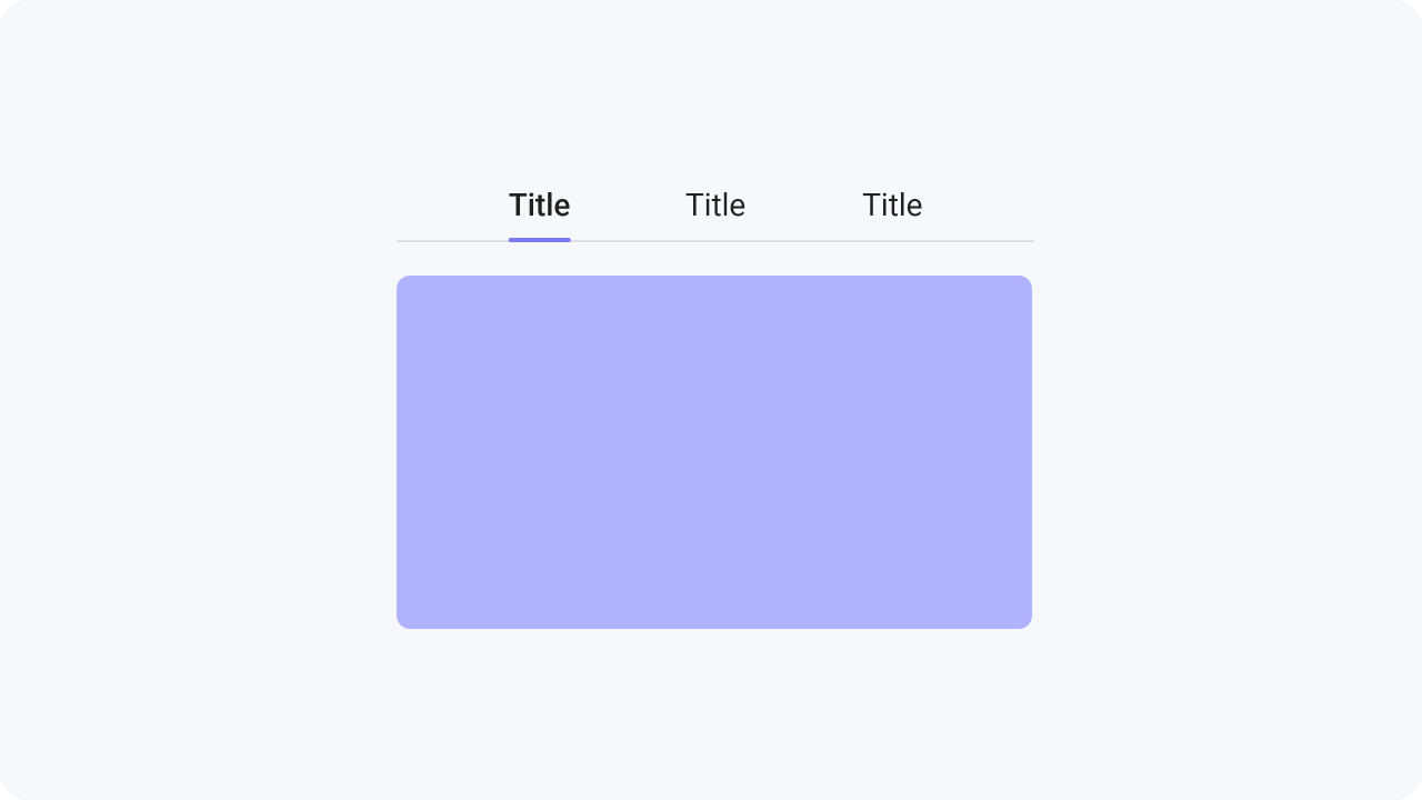
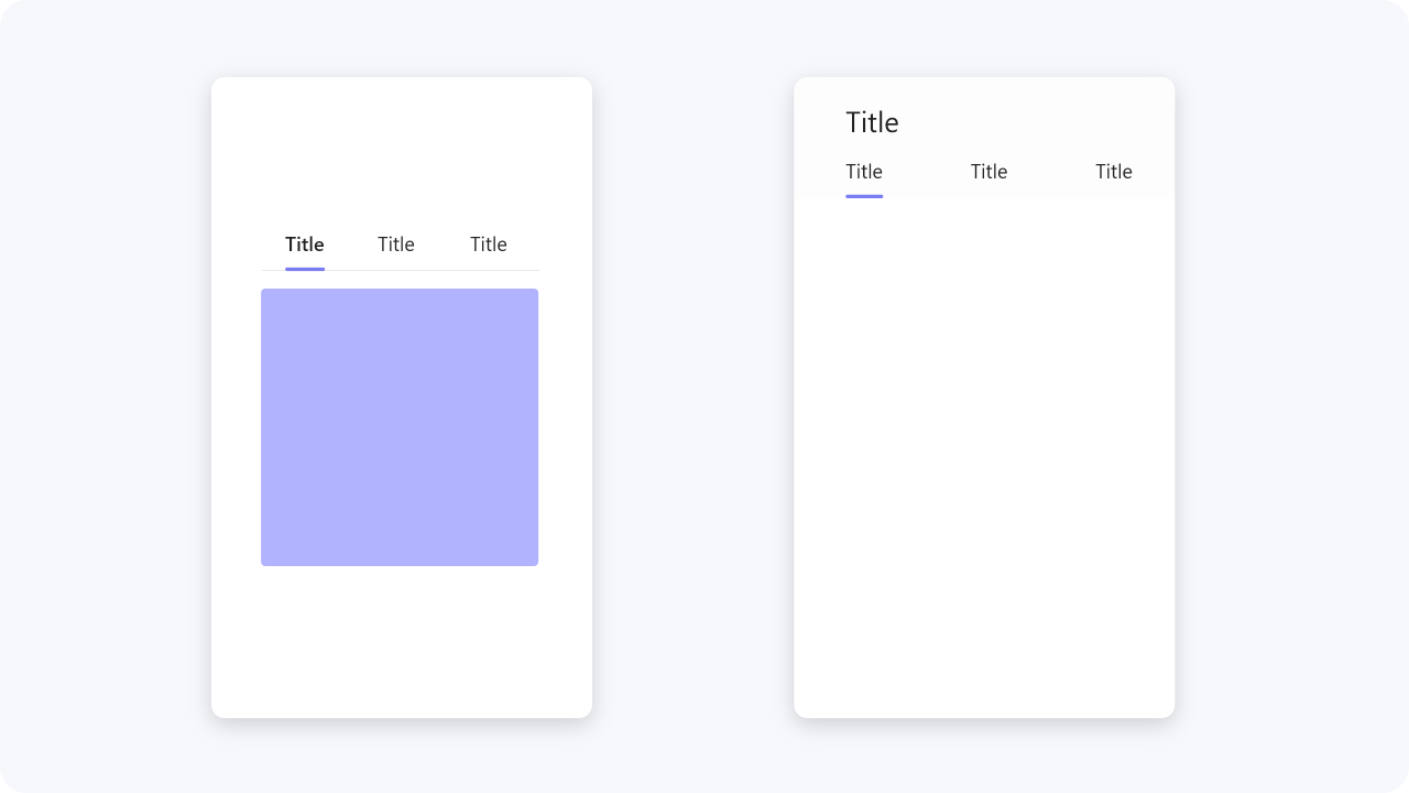
The in page navigation is located directly on the page next to the content and shows the content that is on
this page as well as links to other pages within a web page.
It makes navigation easier and also
orientation between the content that is directly on the page.
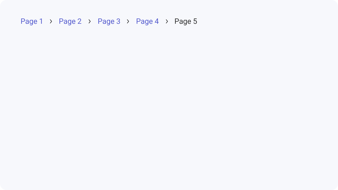
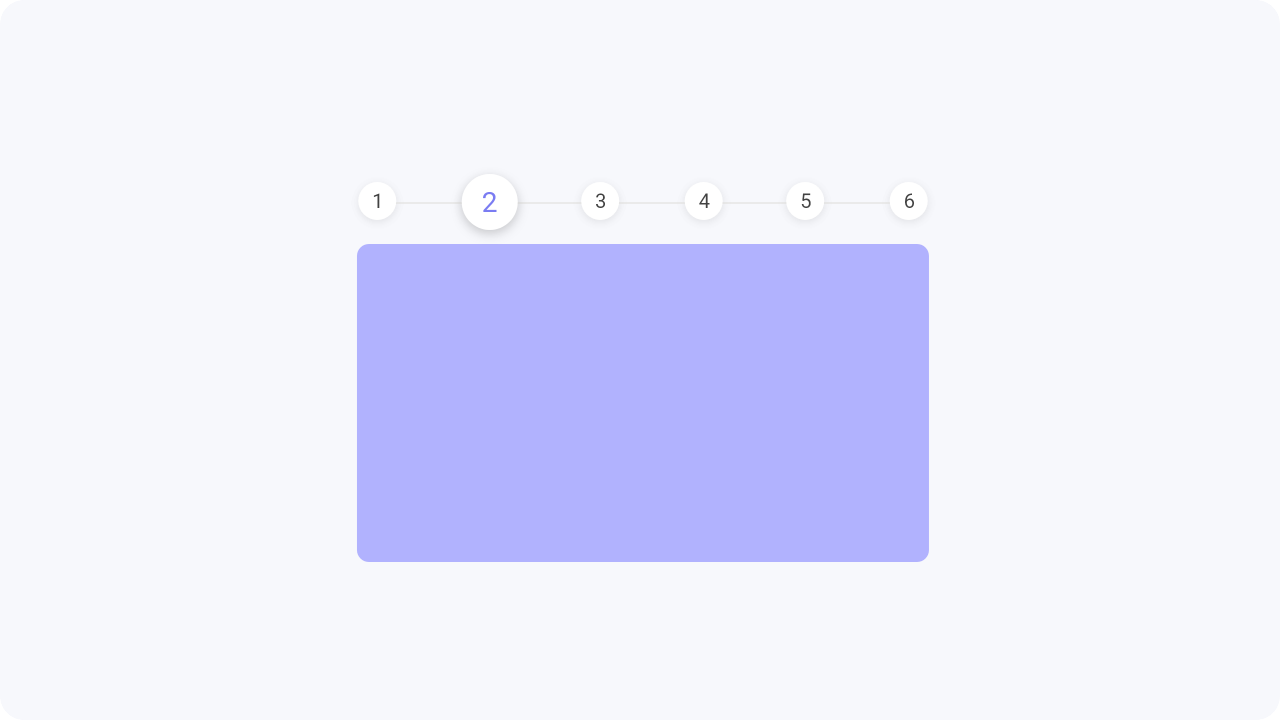
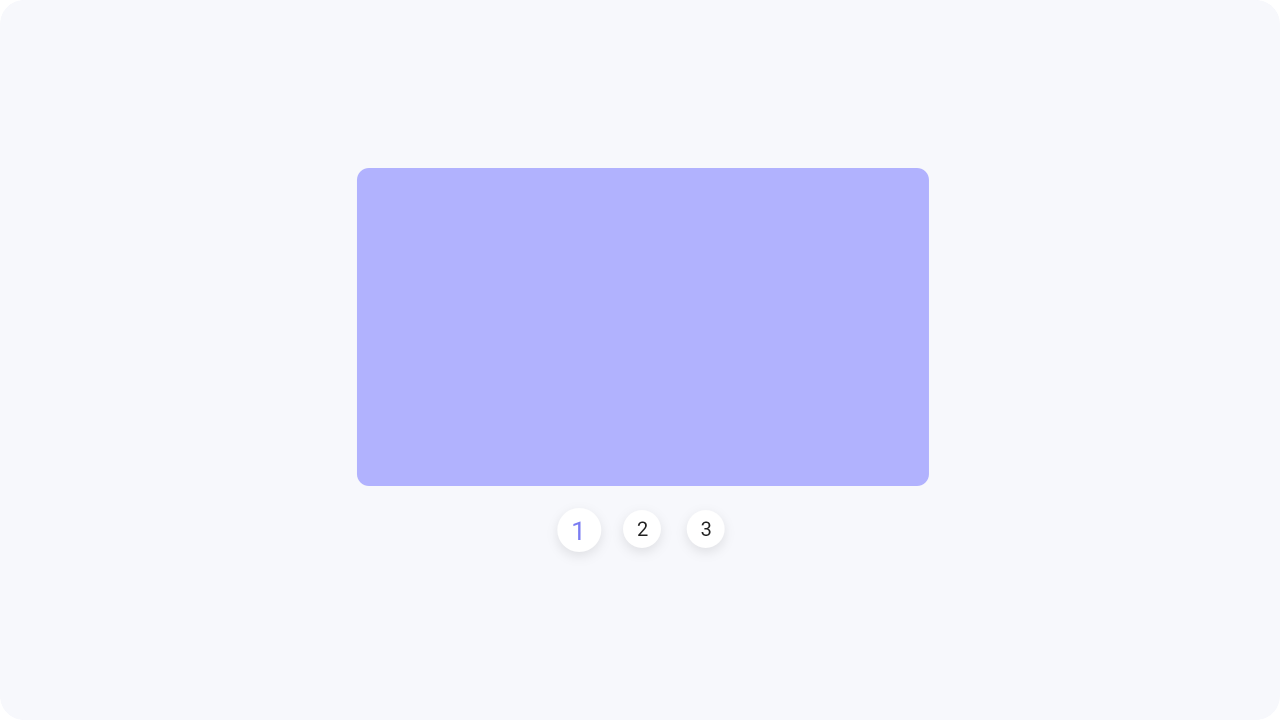
The pagination breaks the content into multiple pages or elements. By clicking on the pagination
or
alternative on forward and backward arrows,
the user can move to the next or previous pages
or
content. Mostly the pagination is above or
below the content.
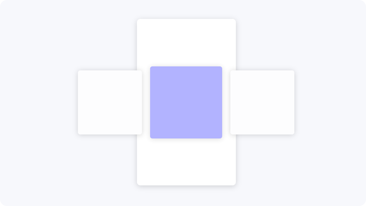
With the content slider, only one part of the content is displayed actively at a time and the other is stored outside the screen area. The other content can be brought onto the screen either by tapping or by swiping.
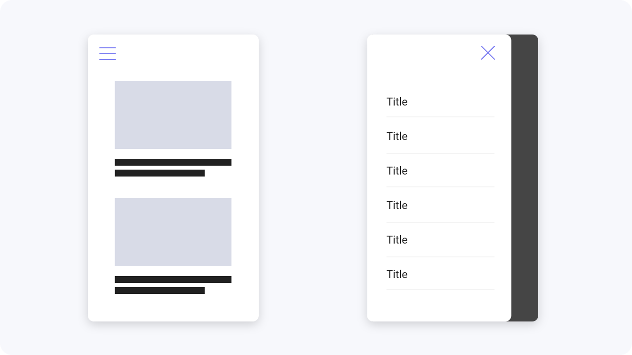
The fullscreen navigation is very similar to the burger menu. This type of navigation is used when there are
too many menu items for a tab bar and there are also subcategories.
It goes over the whole screen so
that as much information as possible can be displayed.
This type of tab bar usually consists only of icons and is intimately understood by the user. Keywords can also be included in addition to the icons. This navigation variant is also very space saving. To make this navigation accessible add elements or other design features to make clear where the user is.
