Buttons
When it comes to design, there are a few basic rules that should be followed. Button design sometimes looks pretty simple, but it goes hand in hand with many apparently small factors that the designer must consider. Here are some guidelines to follow when designing buttons.
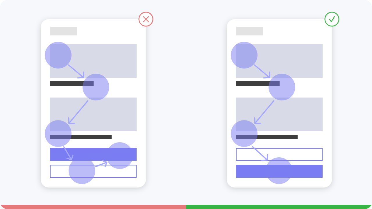
The principle shows how the eye moves along an orientation axis from left to right until
it reaches
the lower right corner. Design elements that lie along the diagonal receive the most attention. Elements
that lie outside the diagonal receive less attention.
The optimal placement of buttons follows the Gutenberg principle. You should place your buttons at the end of the user’s scan path when they are ready to perform an
action.
Links are used when you're navigating to another place, such as: "view all" page, "Max Mustermann" profile, etc.

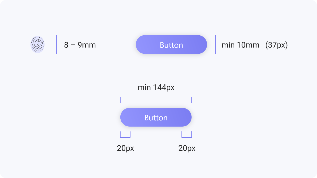
The size of your button is particularly important for mobile designs. Making a button too big will lead to a
visually charged screen, while a button that is too small cannot be clicked on by a normal finger.
MIT’s Touch Lab published a study back in 2003 that found most fingertips to be 8 – 10mm wide.
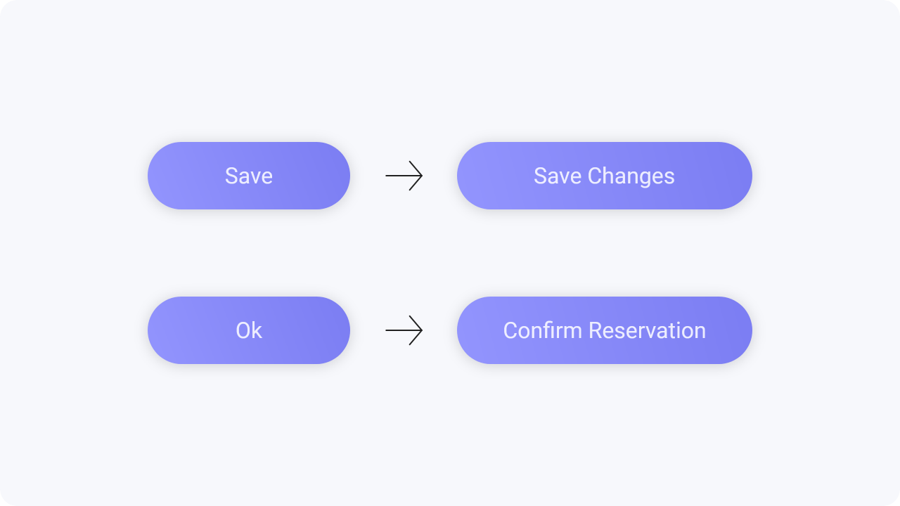
When designing buttons, make sure that the wording is correct, so that it is easy to understand what action is involved here.
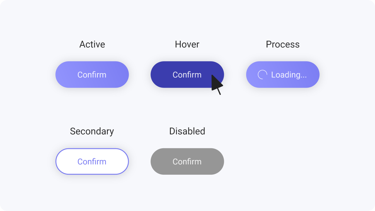
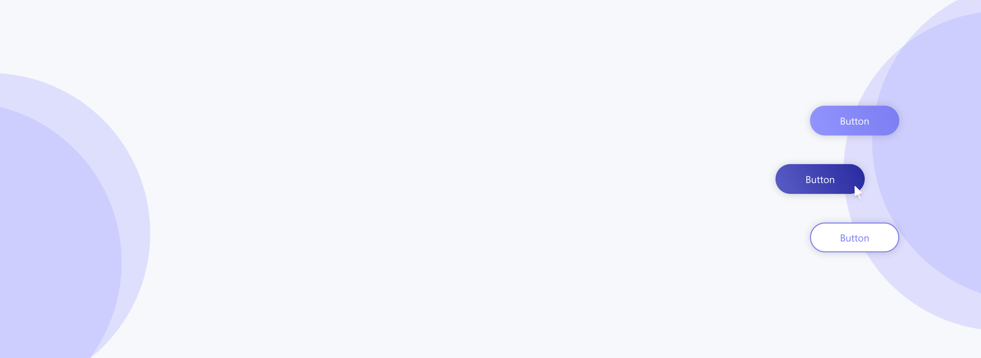
Whenever a user interacts with a button, it should change state to let the user know that something is happening as a consequence of their actions.
Active – interactive and enabled
Secondary – secondary in terms of priority
Hover – curser above an interactive element
Process – in progress of completing the action
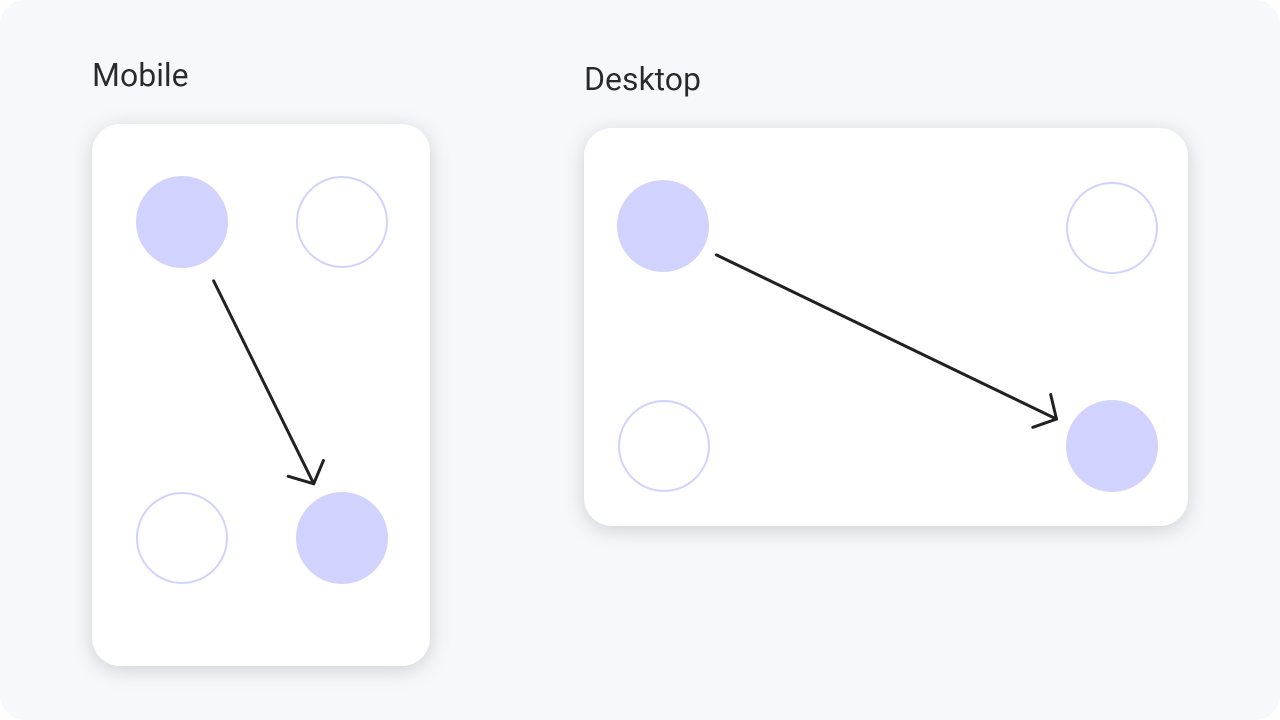
While reading content, an user eye movement starts from top left corner and ends at bottom right, which is finishing part of the content.
Most users start scanning the content from the top left corner and end at the bottom right. When the content ends they look for a call to action. Since they end at the bottom right, it’s better to have a call to action at the bottom.
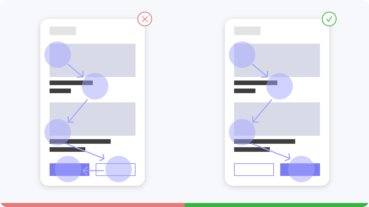
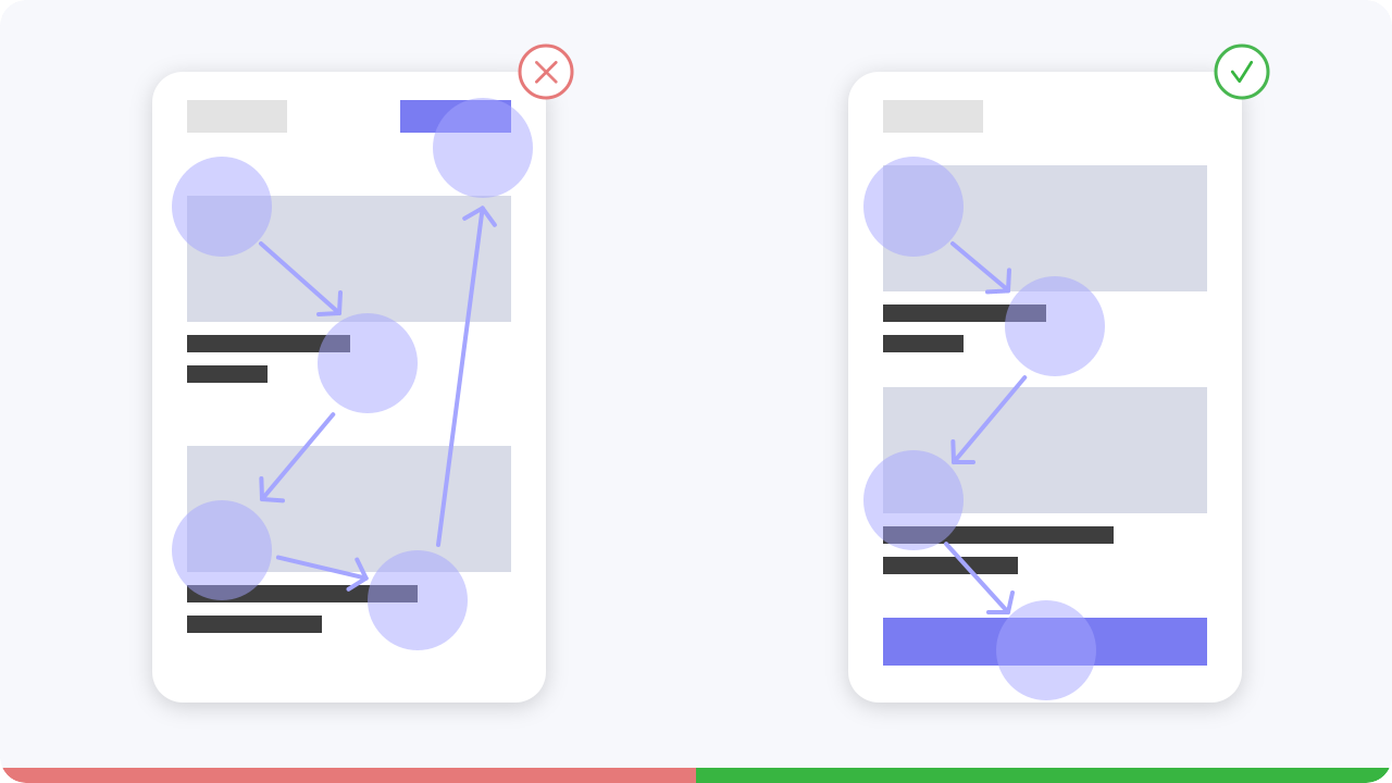
If the primary action is on the left, it works against reader gravity, but if we place the primary action on the right, users take action more quickly because the button is where readers first see it, followed by the secondary action.
If the primary action is at the bottom, the user can get to it faster by just scanning down.
However,
if we place the primary action above the secondary button, the user has to scan down and then up again to
tap it.
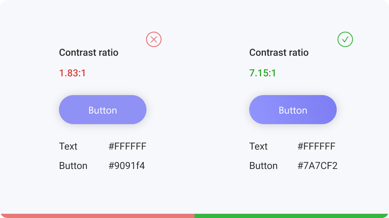
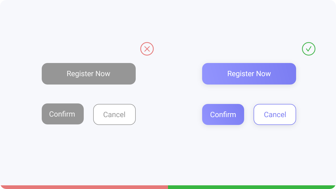
Accessibility of the buttons is also very important.
For visually impaired people it is important
to
check the contrast of the text and the color of the button. With the help of tools this can be
easily tested here.
We open a web page and expect to find the button immediately. No user has ever liked looking for
a
button to press. Place the button where the user would expect to find it and design it clearly.
