In responsive design, a breakpoint is the point at which a website’s content and design will adapt in a certain way in order to provide the best possible user experience. Here you get an Overview over the different Breakpoints for each device.
White space is the area between design elements. It is also the space within individual design elements, including the space between typography glyphs. Despite it’s name, white space does not need to be white. It can be any color, texture, pattern, or even a background image.
Grids bring order to a layout making it easier for visitors to find and navigate trough information. Grids
allow designers to quickly add elements to a layout because many layout decisions are addressed while building
the grid structure. Grids make it easier for other designers to work and collaborate on the design as they
provide
a plan for where to place elements. They lead to consistency in the layout of pages across a
single site or even several sites creating a structural harmony in the design.

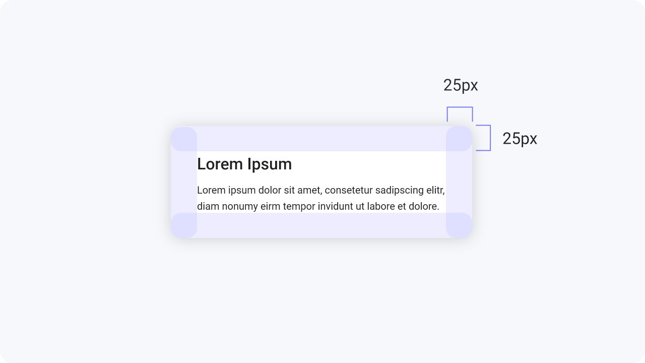
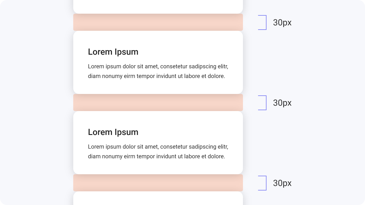
All elements should have the same distance
from the edge and to each other. This helps to
ensure
that your designs are consistent.

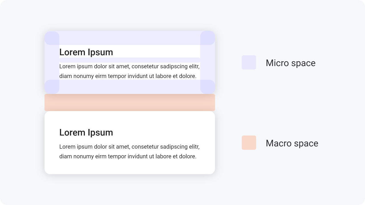
Remember that there are 2 types of whitespace. The
first is Macro Space and the second is Micro Space.
It is the space between bigger
components in the layout.
It is the space between smaller
components and within them.

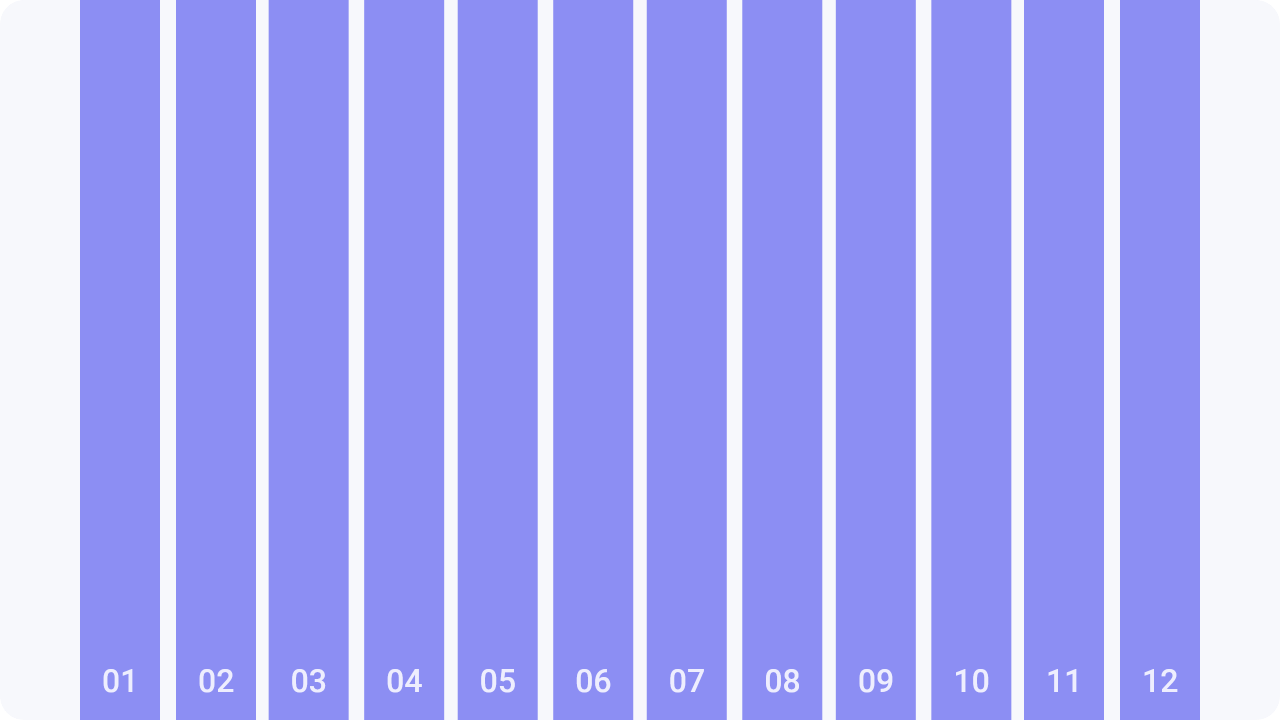
When you are creating any grid, better use 12 columns grids. It’s easier to break it into other sizes with
6, 4, 3 and 2 columns.
Make also sure that there is enough space at
the edges of the touch
devices.
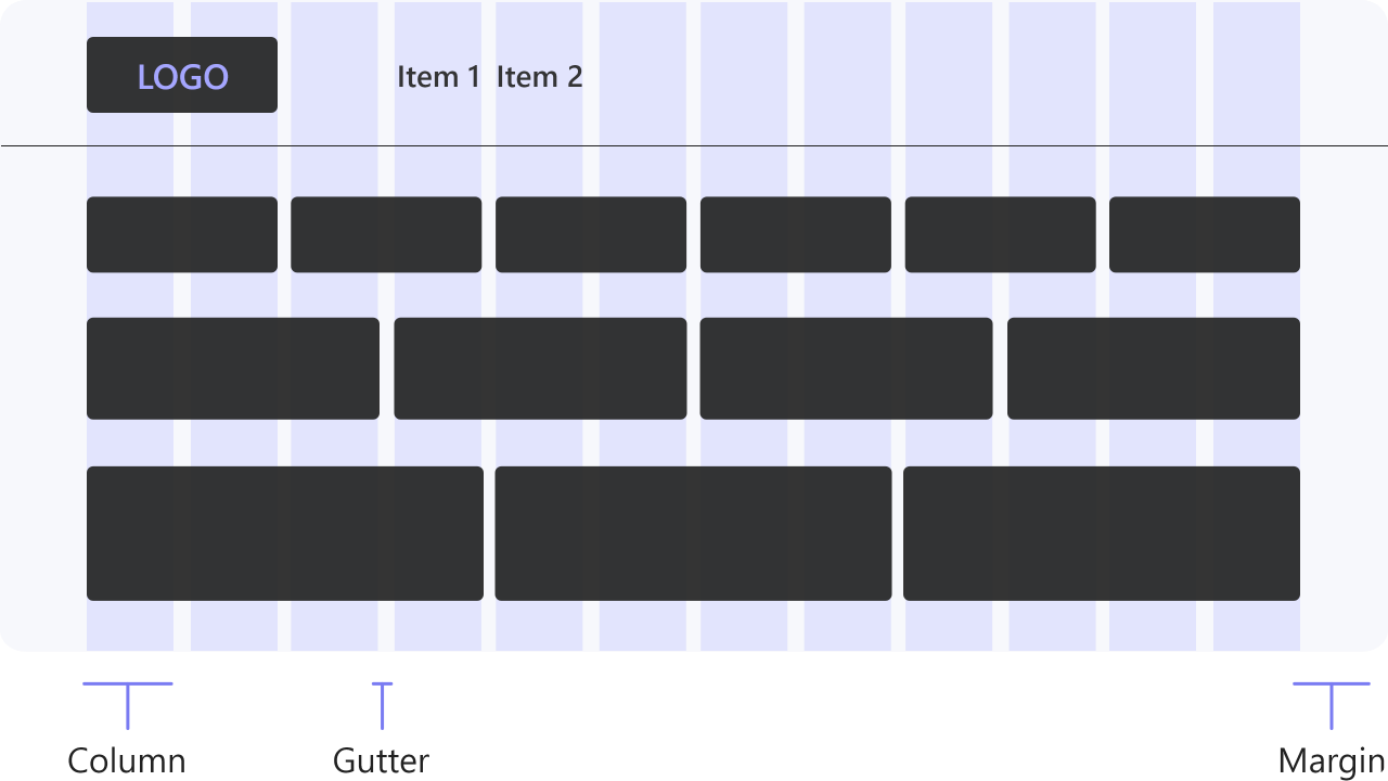

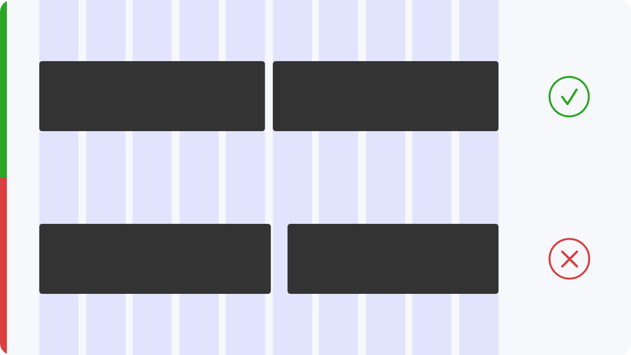
Objects are placed avoiding the gutter space
and the margin on both sides of the website
or
application.
Make sure that you always use enough
space to visually separate the content.
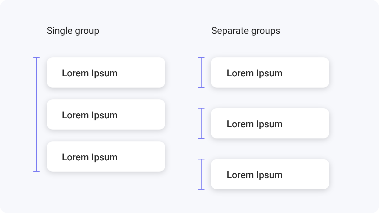
The law of proximity states that elements that are close to each other are more likely to be seen as if they were similar or as if they were part of the group.
Make sure that you always place the content
within the column and never in the gutter.