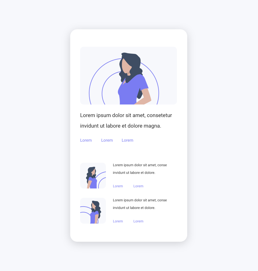


Now that you have the basis of a useable product, it’s time
to design the interface by adding the
visual attributes, colors, icons, shadows, and images, and refining the look and feel.


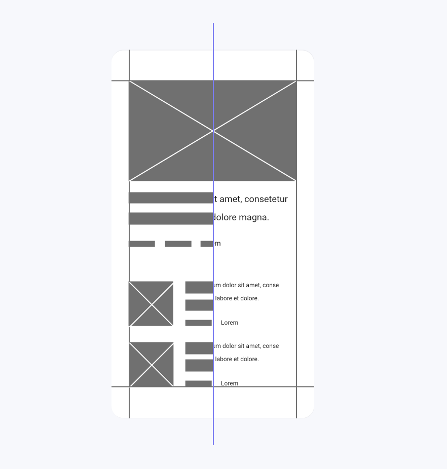
A wireframe is, so to speak, the skeleton or rather a static basic structure. It’s where we take the ideas
we’ve gathered from our sketches and make them digital.
In this step, the texts or other design
elements should not be filled in at the beginning and rather be hinted at. Once you
are sure that it
fits, you can start filling in texts and displaying design elements, but without color or other visual
attributes.
Wireframes can be created on digital platforms using tools like Axure, Adobe XD,
Sketch, Figma or even Photoshop.


First start sketching on paper. Here we are unlimited and not easily distracted by complex software and features. Sketching is an effective way to explore ideas and identify any design problems early on. Sketches don't have to be pretty, and they shouldn’t be. The idea here is to focus on individual ideas, flows, and possible layouts, using simple placeholders for images and text. The point is to explore ideas for your final prototype, so you don’t have to worry about design yet.


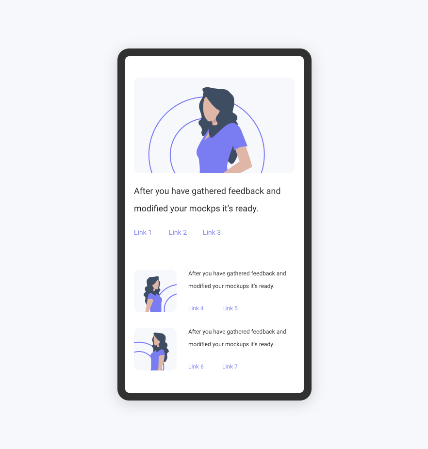
Then, after you’ve gathered feedback and modified your mockups, your app or website is finalized and ready for implementation.


