Also learn about old versus new icons and get inspiration or free icon sets via
links that are provided for you.
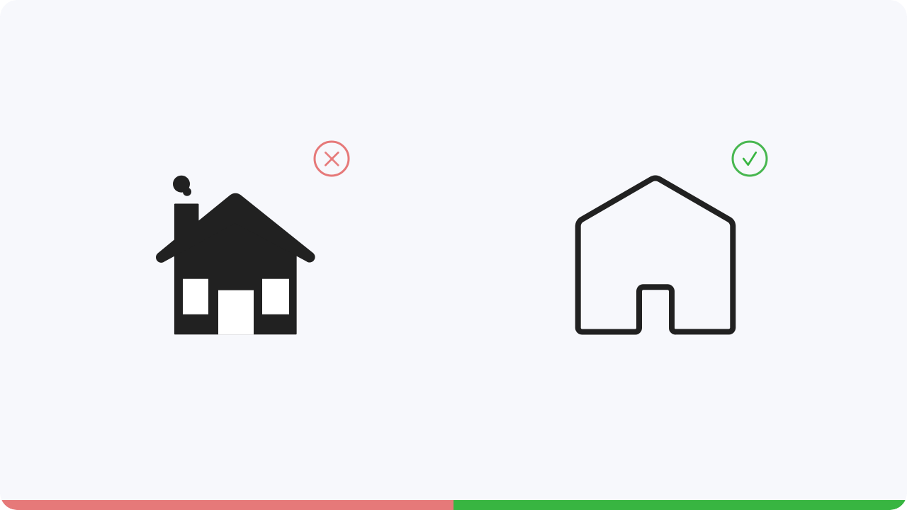
There are many icons that represent something that no longer corresponds to modern times.
However, they
are used because the meaning of them is understandable for many. But wouldn’t
it be better to make icons
more contemporary?
Icons are most effective when they add visual interest and grab the user’s attention.
They help guide
the user when navigating a page or even to reinforce the importance
of actions. Use too many icons and
they will become nothing more than decoration.
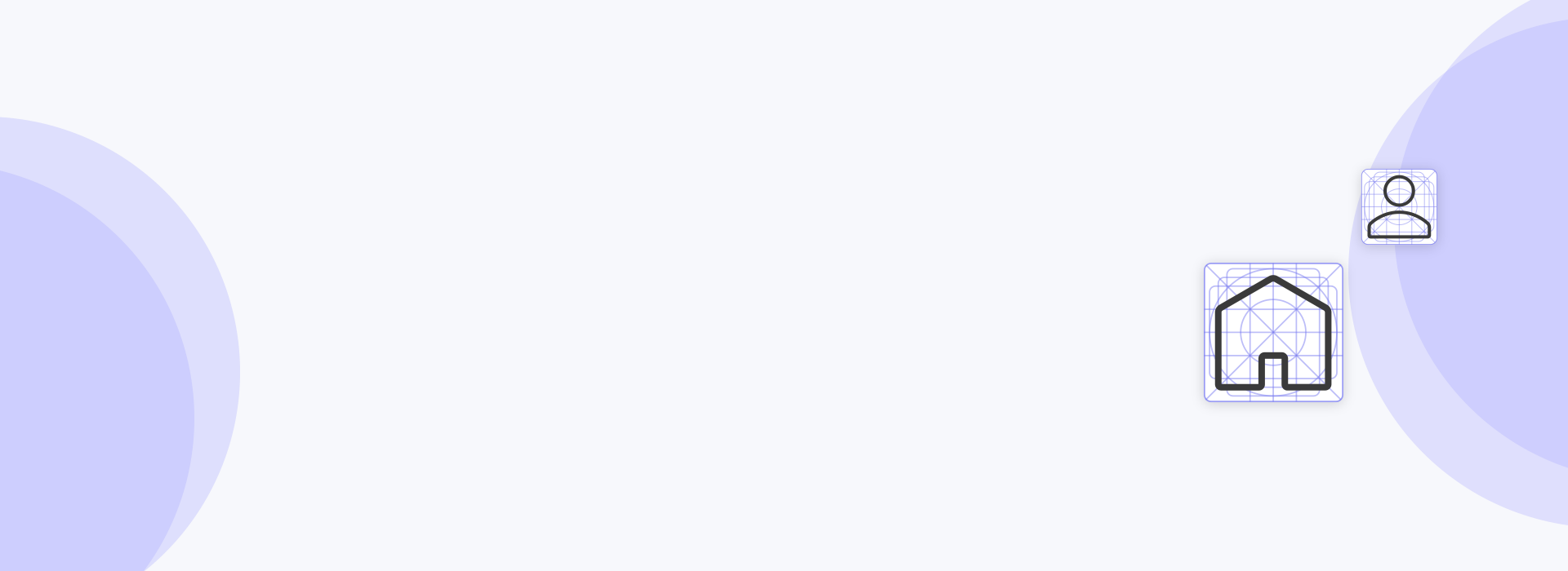
Here are a few examples of how to use icons.
If you’re looking for inspiration to create your own icons or maybe
you’d rather download free icon sets
here are a few links.
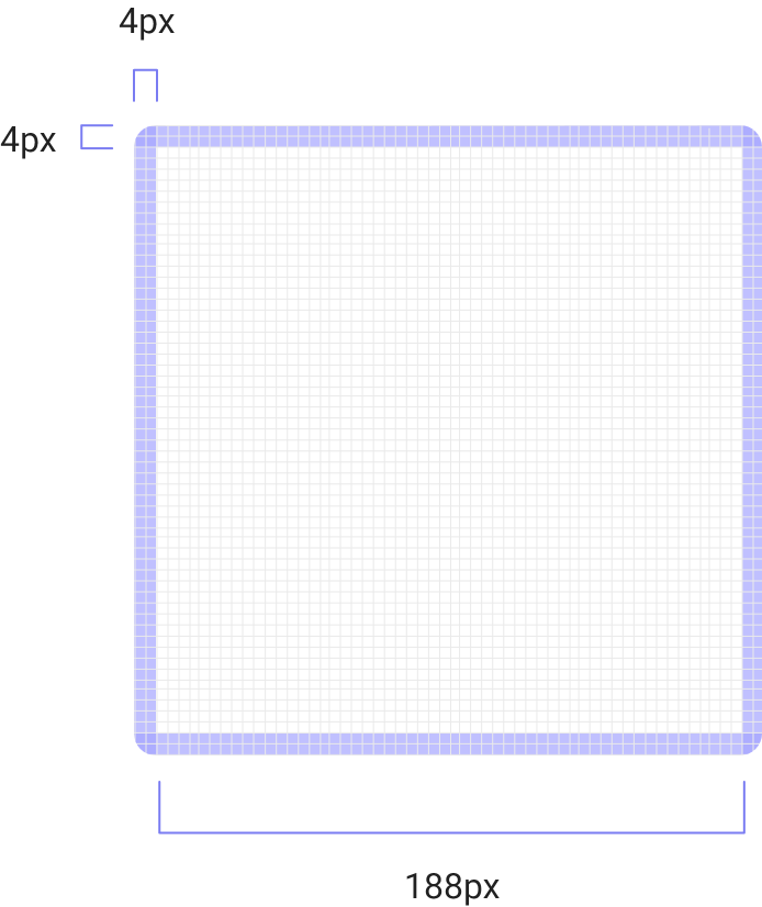
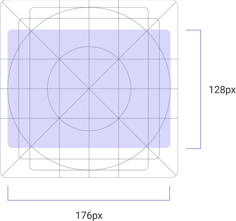
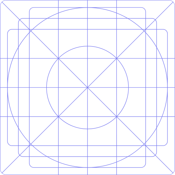
The size of the artboard should be 192 x 192px and
the padding must be 4px. This way all your icons
will
be built in a 188px frame.
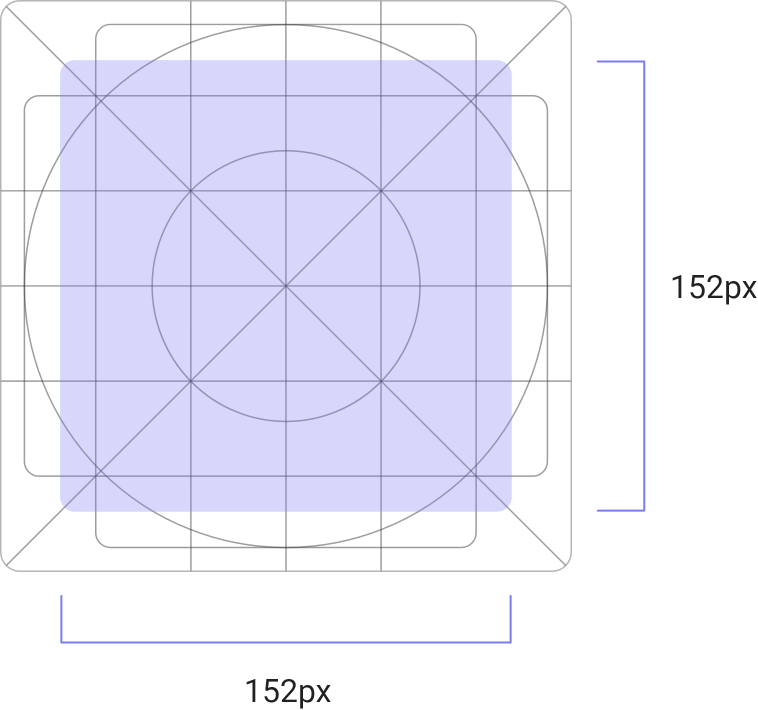
The measurements for this shape are:
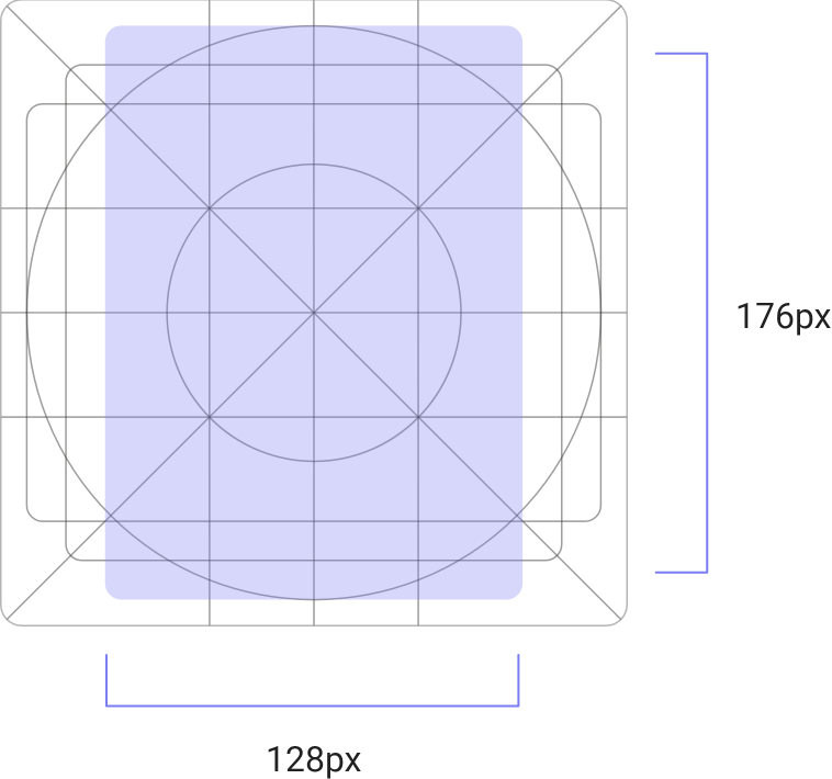
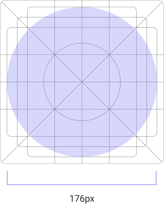
The measurements for this shape are:
The measurements for this shape are:
The measurements for this shape are:
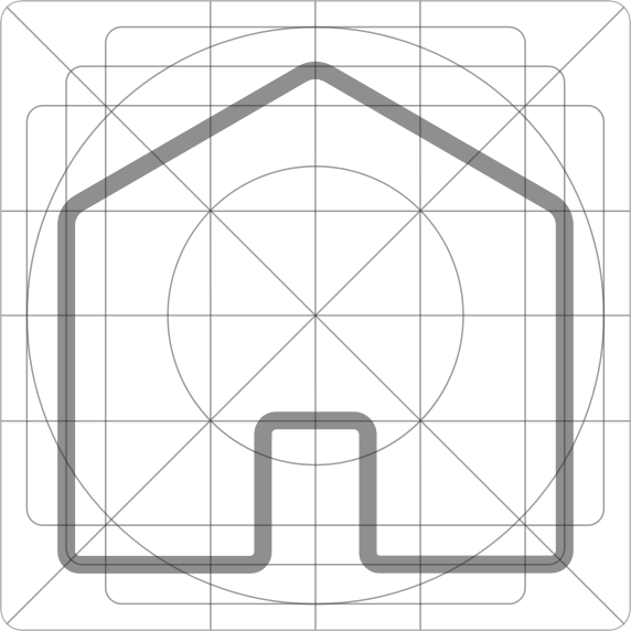
This is how, for example, your icon
would then look in this grid.
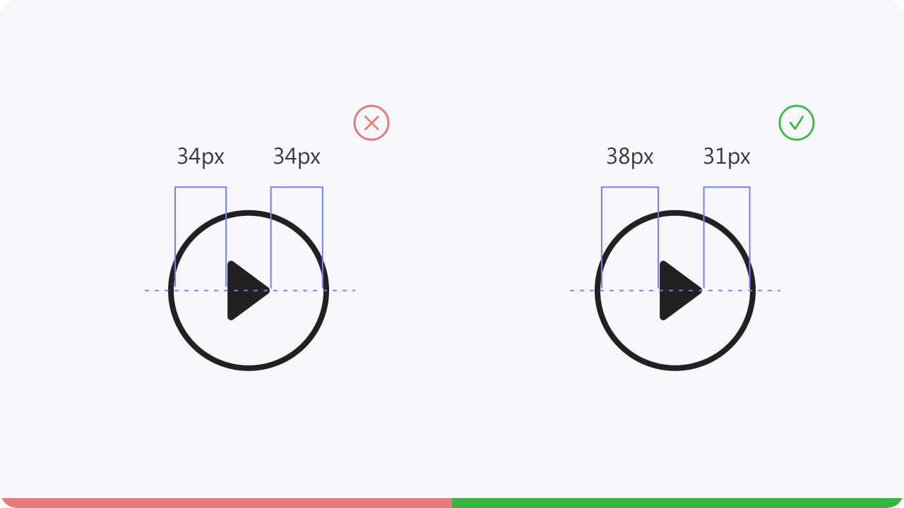
Make sure each icon feels balanced, align
it’s elements visually. Don’t simply trust the
numbers,
use your eye to check your work.
To achieve consistency for an icon family,
keep the same icon style throughout to ensure perfekt
harmony. That means you have to use the same shapes, fill, stroke
thickness and size.
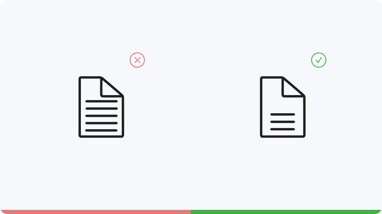
Make sure that all shapes of your icon have enough space. Too thin strokes and spaces will make the icon
harder to understand.
When working with multiple shapes, leave enough space between them or reduce the
amount of shapes.
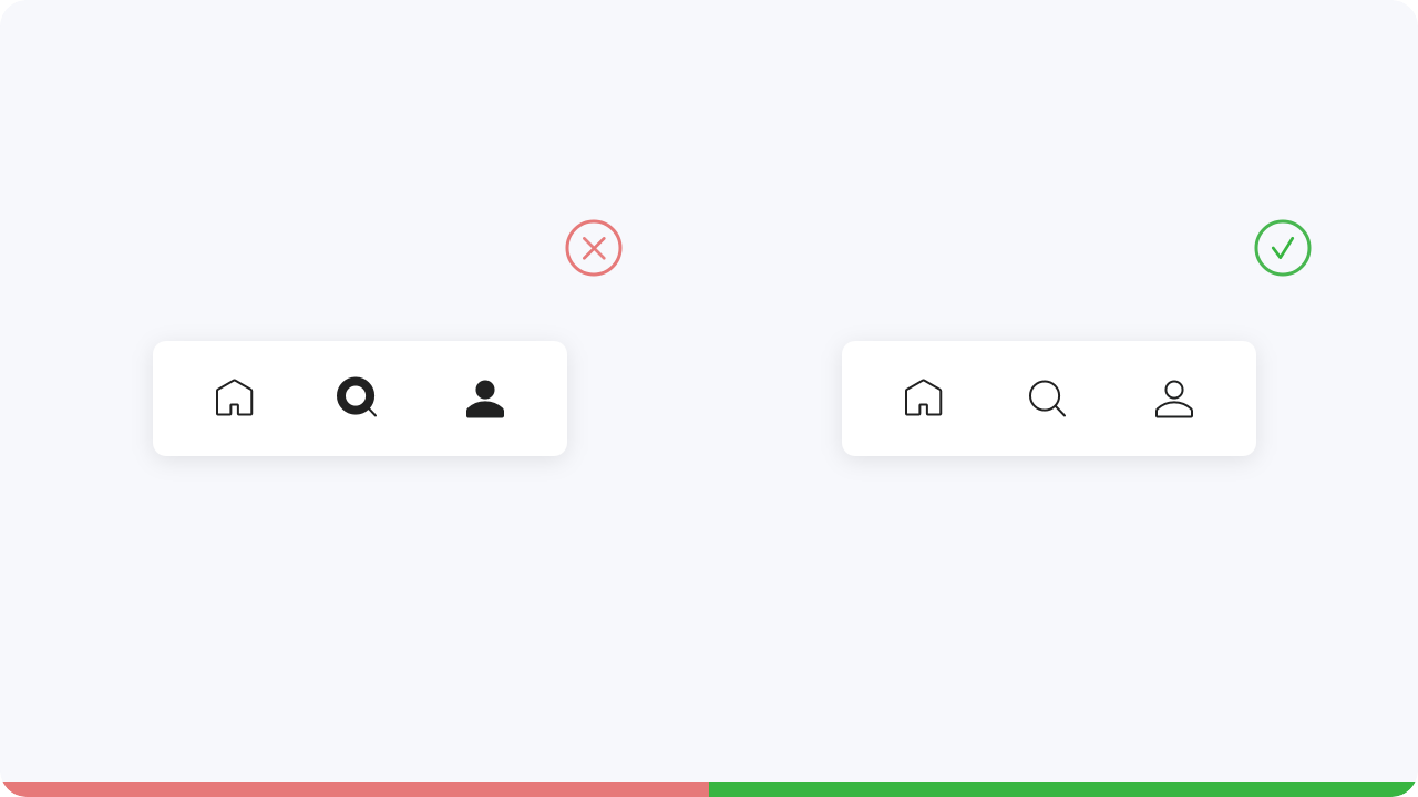
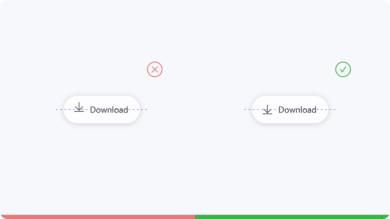
Make sure that your icons, for example in buttons, are centered to the text and also not much bigger than
the text.
This will make your design look choppy and clumsy.
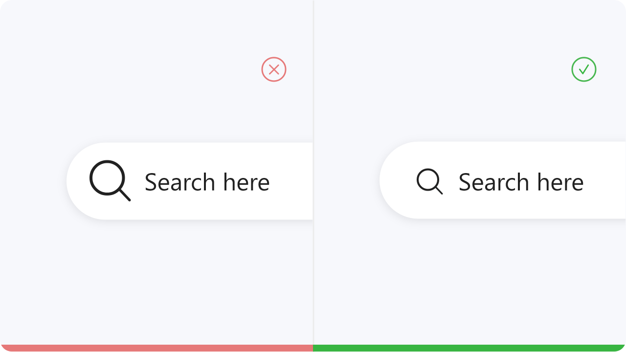
Make sure that the icon in your button is center aligned to the text. Otherwise it looks too restless.
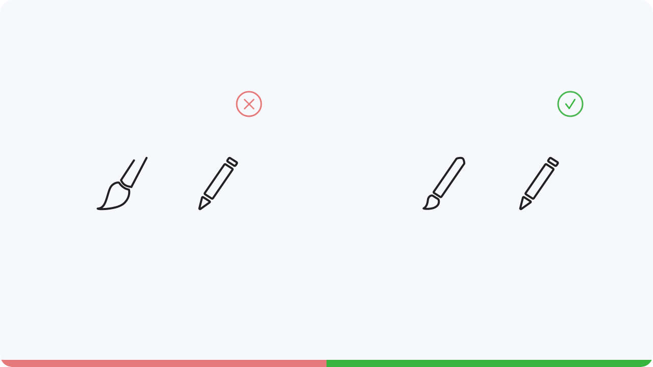
Make sure that the same section is always displayed for icons. As an example, let’s take the brush and pen. If you show only the front part of the brush and not the entire brush, you have to do the same for the pen. This must be done to ensure that all the icons are consistent.
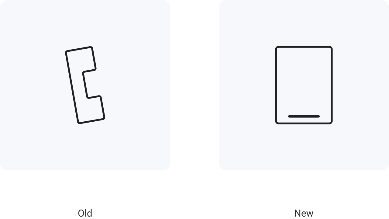
The so called telephone bone is often used for call applications. Older generations still know this type of
phones. But what about the younger ones.
Is it understandable for them? Shouldn’t this be a modern
kind of phone that is also used today?
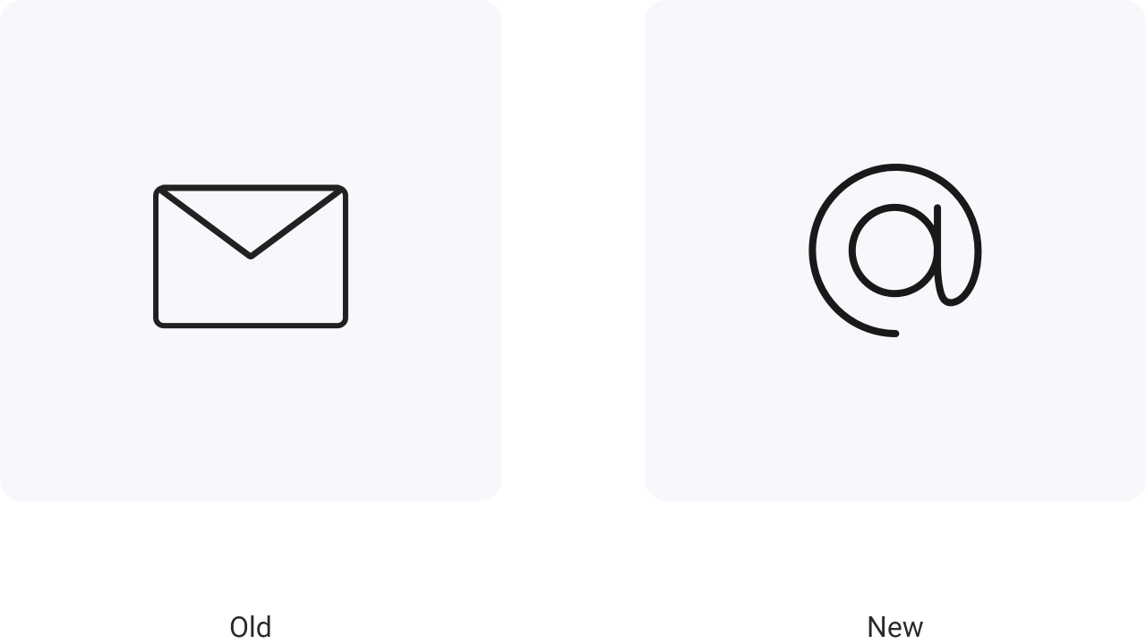
Is a letter still suitable to represent an email, or would there be another symbol that would probably be more suitable?
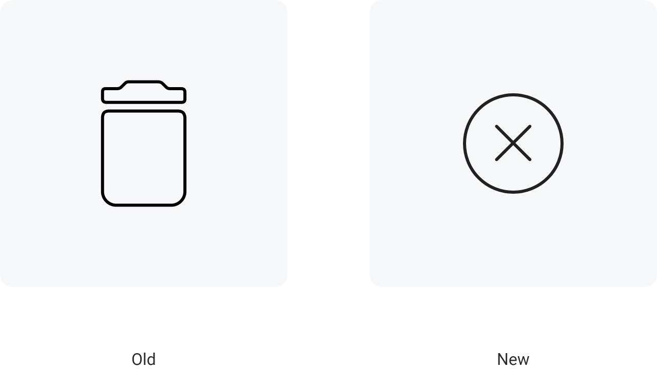
We already know the trash can icon from mobile devices as well as from desktops and laptops. But do we really throw our digital data into a garbage can?
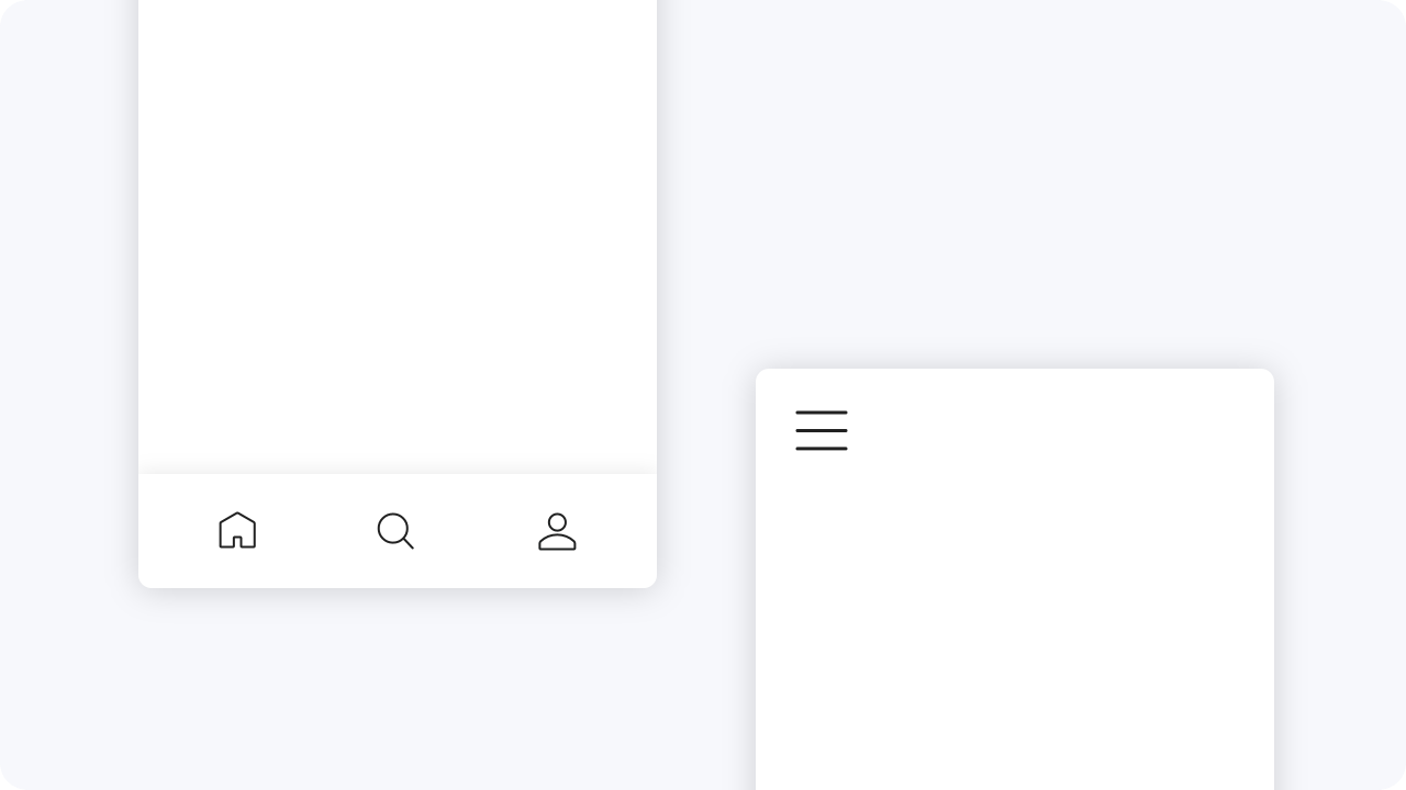
Icons are often used within navigation elements. Two examples would be the tab bar on mobile devices and the burger menu. To make the icons in the tab bar really understandable, you can also add text to strengthen their meaning.
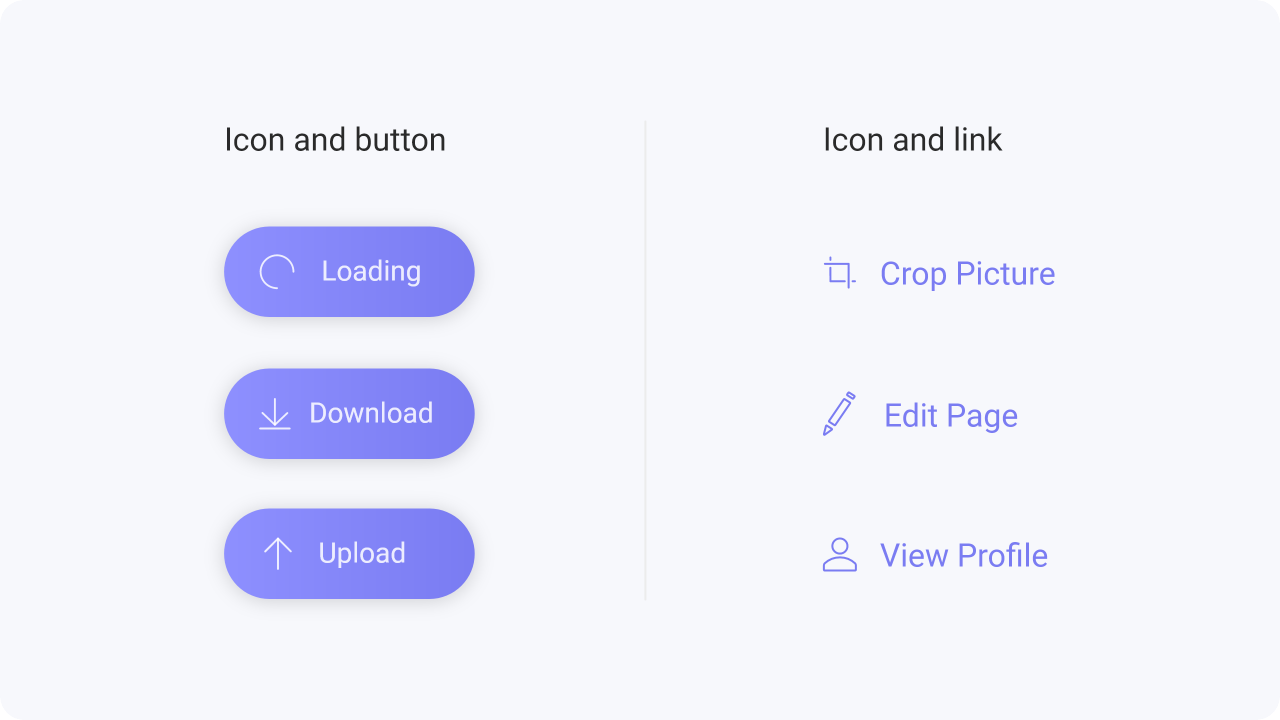
Icons can be used in buttons or with links to strengthen the meaning of them.
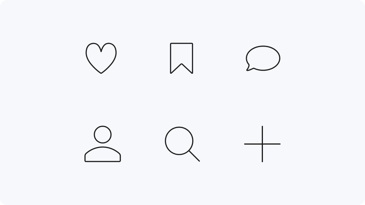
Icons are also often used to represent shortcuts. An example of this would be in social media.
You
give a like by tapping or clicking on the heart icon or start writing a comment by tapping or clicking on
the speech bubble.


